Empowering 0+ Free Online Tools
All tools are 100% free. Check out our Extractor, Generator, Compressors, Converters, Downloaders, Calculators and more.
Yttags Helping Millions of Webmasters, Students, Teachers, developer & SEO Experts Every Month.

Youtube tools
Tag Extractor, Tag Generator, Title Generator, Comment Picker, Trending Worldwide, Trending Videos, Timestamp Link , Length Checker etc.
Youtube tools
Tag Extractor, Tag Generator, Title Generator, Comment Picker, Trending Worldwide, Trending Videos, Timestamp Link , Length Checker etc.


SEO tools
Keyword Suggestion, Google Ads Revenue, Meta Tag, Domain Age Checker, Slug Generator, Article Rewriter, etc.
SEO tools
Keyword Suggestion, Google Ads Revenue, Meta Tag, Domain Age Checker, Slug Generator, Article Rewriter, etc.


HTML tools
Link Extractor, BBCode Generator, Mailto link Generator, Social Share Link Generator, Twitter Intent Generator, HTML Hyperlink, etc.
HTML tools
Link Extractor, BBCode Generator, Mailto link Generator, Social Share Link Generator, Twitter Intent Generator, HTML Hyperlink, etc.


Text tools
Find and Replace, Convert CASE, Alien Translator, Number Extractor, Invisible Character, Unicode Text, Hashtag Counter, etc.
Text tools
Find and Replace, Convert CASE, Alien Translator, Number Extractor, Invisible Character, Unicode Text, Hashtag Counter, etc.


Random Tools
Random IMEI, Credit Card, Flag, Number, Fake Address, Fake Tweet, Random Maze, Random Dice, Tiefling Names, etc.
Randomization tools
Random IMEI, Credit Card, Flag, Number, Fake Address, Fake Tweet, Random Maze, Random Dice, Tiefling Names, etc.


Website tools
Page Snooper, Password, URL Splitter, QR Code, MD5 Hash, etc.
Website tools
Page Snooper, Password, URL Splitter, QR Code, MD5 Hash, etc.


Image tools
MB to KB, PNG to JPG,Dummy Image, AVIF Converter, Photo to Cartoon, SVG to Data URI, WEBP Converter, JPEG to 100KB, etc.
Image tools
MB to KB, PNG to JPG,Dummy Image, AVIF Converter, Photo to Cartoon, SVG to Data URI, WEBP Converter, JPEG to 100KB, etc.


Beautifiers
JavaScript, JSON Beautifier & Minifier, CSS Beautifier, HTML Formatter, XML Formatter, JSON Validator & Formatter, SQL Formatter etc.
Beautifiers
JavaScript, JSON Beautifier & Minifier, CSS Beautifier, HTML Formatter, XML Formatter, JSON Validator & Formatter, SQL Formatter etc.


Physics Calc
Kinetic Energy, Displacement, Cutoff, Acceleration, Gay-Lussac's, Law,Boyle's Law, Beer Lambert Law Calculator, Frequency, etc.
Physics Calculators
Kinetic Energy, Displacement, Cutoff, Acceleration, Gay-Lussac's Law,Boyle's Law, Beer Lambert Law Calculator, Frequency, etc.


Date/Time Calc
Age, Tree Age, Dog Age, Tire Age, Leap Year, Unix Timestamp, Half Birthday, etc.
Date & Time Calculators
Age, Tree Age, Dog Age, Tire Age, Leap Year, Unix Timestamp, Half Birthday, etc.


Financial Calc
Stripe & PayPal Fee Calculator, Percent Off Calc, Tip Calculator, Home Loan Calc, GST Calculator, Money Counter, EMI Calculator, etc.
Financial Calculators
Stripe & PayPal Fee Calculator, Percent Off Calc, Tip Calculator, Home Loan Calc, GST Calculator, Money Counter, EMI Calculator, etc.


Math Calc
Percent Error Calc, Fraction, Slope, Probability, Mean, Median, Mode, Range , Billion, Million, Trillion Calc, Circle Calc, Profit Margin Calculator, etc.
Math Calculators
Percent Error Calc, Fraction, Slope, Probability, Mean, Median, Mode, Range , Billion, Million, Trillion Calc, Circle Calc, Profit Margin Calculator, etc.


Converters
Speed, Unicode Converter, KB to MB, Trillion To Million, Fuel, CSV To JSON, Angle Converter, Paper size converter, etc.
Converters
Speed, Unicode Converter, KB to MB, Trillion To Million, Fuel, CSV To JSON, Angle Converter, Paper size converter, etc.


Color Tools
Color Code Picker, RGB to HEX Converter, HEX to Pantone Converter, Gradient Background, etc.
Color Converters
Color Code Picker, RGB to HEX Converter, HEX to Pantone Converter, Gradient Background, etc.


Health Calc
Age Calculator, BMI & BMR Calculator, IQ Calculator, Daily Water Intake Calc, Pregnancy Calc, Wilks Calc, Calorie Calc, Sleep calculator, etc.
Health Calc
Age Calculator, BMI & BMR Calculator, IQ Calculator, Daily Water Intake Calc, Pregnancy Calc, Wilks Calc, Calorie Calc, Sleep calculator, etc.


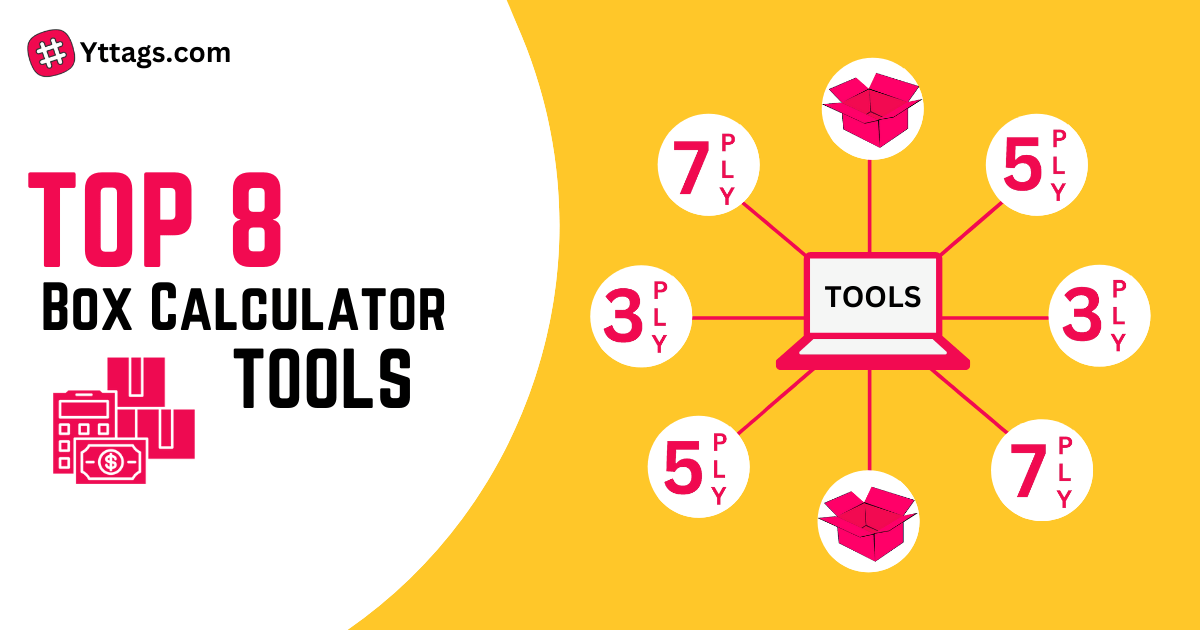
Box Calc
Duplex Box, 3 Ply, 5 Ply, 7 Ply etc.


Sports Calc
DL Method Calc, ERA Calc, Winning Percentage, Run Rate Calc, Batting & Bowling Strike Rate Calc, Batting, Economy Rate Calc, Match Net Run Rate Calculator, Average Calc, etc.
Sports Calculators
DL Method Calc, ERA Calc, Winning Percentage, Run Rate Calc, Batting & Bowling Strike Rate Calc, Batting, Economy Rate Calc, Match Net Run Rate Calculator, Average Calc, etc.


Other tools
Flames Calculator, Flip a Coin, Death calculator, Love calculator , Search by IFSC Code, Tombstone Generator, Microwave Cooking Time, KD Calculator, etc.
Other tools
Flames Calculator, Flip a Coin, Death calculator, Love calculator , Search by IFSC Code, Tombstone Generator, Microwave Cooking Time, KD Calculator, etc.


All tools
See all tools in one giant list. There are over 250+ tools!
Our Blog


Yttags statistics
500
Tools done
141
Happy clients
172
Cups of coffee
18
Categories
SEO Services
LITE
$499
- Total Keywords - 10
- Primary Keywords - 6
- Secondary Keywords - 4
- Website Analysis & Recommendations
- Keywords Research & Mapping
- Backlink Analysis
- User Experience Analysis
- Competitors Analysis -3
- Google Analytics Setup
- Conversion Tracking Setup
- On-Page Optimization
- Page Speed Optimization
- Mobile Friendliness Check & Optimization
- Robots.txt File Creation
- XML Sitemap Creation
- Blog Writing - 3
- Guest Blog Post - 3
- Press Release Writing & Distribution - 0
- Local Search Website Optimization
- Link Acquisition Strategy
- SEO Link-Earning Reports
- Monthly SEO Performance Reports
- Customer Support (Email, Chat & Telephone)
Most Popular
STANDARD
$749
- Total Keywords - 15
- Primary Keywords - 10
- Secondary Keywords - 5
- Website Analysis & Recommendations
- Keywords Research & Mapping
- Backlink Analysis
- User Experience Analysis
- Competitors Analysis - 5
- Google Analytics Setup
- Conversion Tracking Setup
- On-Page Optimization
- Page Speed Optimization
- Mobile Friendliness Check & Optimization
- Robots.txt File Creation
- XML Sitemap Creation
- Blog Writing - 5
- Guest Blog Post - 5
- Press Release Writing & Distribution - 1
- Local Search Website Optimization
- Link Acquisition Strategy
- SEO Link-Earning Reports
- Monthly SEO Performance Reports
- Customer Support (Email, Chat & Telephone)
PREMIUM
$999
- Total Keywords - 20
- Primary Keywords - 12
- Secondary Keywords - 8
- Website Analysis & Recommendations
- Keywords Research & Mapping
- Backlink Analysis
- User Experience Analysis
- Competitors Analysis - 7
- Google Analytics Setup
- Conversion Tracking Setup
- On-Page Optimization
- Page Speed Optimization
- Mobile Friendliness Check & Optimization
- Robots.txt File Creation
- XML Sitemap Creation
- Blog Writing - 7
- Guest Blog Post - 7
- Press Release Writing & Distribution - 1
- Local Search Website Optimization
- Link Acquisition Strategy
- SEO Link-Earning Reports
- Monthly SEO Performance Reports
- Customer Support (Email, Chat & Telephone)
Unit Converters 0
- Angle Converter
- Area Converter
- Astronomical Converter
- Bytes/Bits Converter
- Density Converter
- Electric Current Converter
- Energy Converter
- Hours to Seconds Converter
- Hours from Now Calculator
- Force Converter
- Frequency Converter
- Frequency Wavelength Calculator
- Fuel Converter
- KG to LBS Converter
- LBS to KG Converter
- Length Converter
- Mass Converter
- Power Converter
- Pressure Converter
- Seconds to Hours Converter
- Speed Converter
- Temperature Converter
- Time Converter
- Torque Converter
- Volume Converter
- Weight Converter
Converters 0
- ASCII to Text
- ASCII Converter
- ASCII to Hex converter
- ASCII to Decimal Converter
- HEX to ASCII converter
- Decimal to ASCII Converter
- Text to Hashtags
- Text To Morse Code
- CSV to JSON
- CSV to SQL
- CSV to XML
- CSV to YAML
- CSVJSON to JSON
- Data URI to Image
- Hex to IP
- IP to Hex
- HTML to Markdown
- Image to Data URI
- INI to JSON
- INI to XML
- INI to YAML
- JSON to C#
- JSON to CSV
- JSON to JAVA
- JSON to PHP
- JSON to Protobuf
- JSON to XML
- JSON to YAML
- YAML to JSON
- KB to MB Converter
- SQL to JavaScript
- SQL to JSON
- SQL to MongoDB
- SVG to Data URI
- Text to ASCII
- Text to Hex
- XML to JSON
- XML to YAML
Beautifiers 0
Formatters 0
Minifiers 0
Extractors 0
- Email Extractor
- Files URL's Extractor
- Numbers Extractor
- Phone Number Extractor
- SSN Extractor
- URL Extractor
- Regex Matches Extractor
Finance Calculators 0
- APY Calculator
- Compound Interest Calculator
- Dividend Yield Calculator
- EBITDA Calculator
- ELSS Calculator
- EMI Calculator
- EPF Calculator
- FD Calculator
- Flat vs Reducing Rate Calculator
- Future Value Calculator
- Gratuity Calculator
- HRA calculator
- Inflation Calculator
- Lumpsum Calculator
- Mutual Fund Returns Calculator
- NPS Calculator
- PPF Calculator
- RD Calculator
- Simple Interest Calculator
- SIP Calculator
- SWP Calculator
- TDS Calculator
- IRR Calculator
- ROI Calculator
Youtube Tools 0
- YouTube Channel ID Finder
- YouTube Downloader
- YouTube Embed Code Generator
- YouTube Hashtag Extractor
- YouTube Income Calculator
- YouTube Money Calculator
- YouTube Tag Extractor
- YouTube Tag Generator
- YouTube Thumbnail Downloader
- YouTube Timestamp Link Generator
- YouTube Description Extractor
- YouTube Title Extractor
- YouTube Title Generator
- YouTube Title Length Checker
- YouTube Trending Videos
- YouTube Trending Worldwide
- YouTube Random Comment Picker
Image Tools 0
- Base64 to Image
- Base64 to PNG
- Base64 to PDF
- BMP to JPG
- GIF to WEBP
- JFIF to PNG
- JPG to PDF
- JPG to PNG
- JPG to WEBP
- MB to KB
- PNG to BMP
- PNG to JPG
- PNG to WEBP
- WEBP to GIF
- WEBP to JPG
- WEBP to PNG
- AVIF Converter
- Pixel Converter
- WEBP Converter
SEO Tools 0
- Blog Title Generator
- Domain Age Checker
- FAQ Schema Generator
- Keyword Suggestion
- Link Extractor
- Meta Tag Generator
- Meta Tags Analyzer
- Meta Length Checker
- Privacy Policy Generator
- Robots.txt Generator
- URL Slug Generator
- UTM Builder
Color Converters 0
- Color Code Picker
- HEX to Pantone Converter
- Pantone to Cmyk Converter
- RGB to Hex Converter
- Gradient Background Generator
Health Calculators 0
- Age Calculator
- Blood Alcohol Content Calculator
- Blood Type Calculator
- BMI Calculator
- BMR Calculator
- Body Shape Calculator
- Body Surface Area Calculator
- Calorie Calculator
- Calories Burned calculator
- Conception calculator
- Day of the Week Calculator
- Max Heart Rate Calculator
- Period calculator
- Pregnancy Calculator
- Pregnancy Due Date Calculator
- Sleep calculator
- Wilks Calculator
- Daily Water Intake Calculator
Text Tools 0
- Add Commas to Numbers
- Add Line Breaks
- Add Prefix & Suffix
- Center Text
- Compare Two Lists
- Concatenate Text
- Difference Checker
- Find and Replace
- Invisible Character
- Justify Text
- Pronounceable Password
- Remove Letter Accents
- Remove Unwanted Characters
- Remove Characters
- Remove Commas
- Replace new lines with commas
- Remove Punctuation
- Remove Line Breaks
- Remove/Replace Double Quotes
- Remove Numbers From Text
- Sort List
- Text Length Calculator
- Text Repeater
- Text Compare
- Word Wrap
- Word Shuffler
FB Insta Bio 0
- Fb vip work copy
- Fb vip bio
- Facebook vip work copy
- Facebook stylish work
- Facebook vip bio
- Facebook vip
- Facebook stylish bio text
- Facebook vip work
- Facebook vip cover photo
- Facebook vip bio text copy
- Vip facebook account
- Funny Comments For Friends Pic
- Nature Captions for Instagram
- Travel Captions for Instagram
- Instagram Captions For Boys
- Instagram Captions For Girls
- Aesthetic Captions for Instagram
- Sister Captions for Instagram
- Sad Captions for Instagram
- Sunset Captions for Instagram
- Hindi Captions For Instagram
- Love Bio for Instagram
- Aesthetic Bio For Instagram
- Birthday Bio For Instagram
- Instagram Bio For Boys
- Bio for Instagram for Girls
- Instagram Vip Bio Stylish Font
- Discord Bio Templates
- WhatsApp Bio For Boys
- Username For Instagram For Girls
- Instagram Stylish Name
- YouTube Channel Names
- WhatsApp Group Names
- Instagram Notes Ideas
- Comments For Girls Pic
Website Tools 0
- Article Rewriter
- Base64 Encode and Decode
- Bcrypt Password Generator
- CHMOD Calculator
- HTML Encoder Decoder
- HTML Escape Unescape
- HTML Hyperlink Generator
- Link to HTML Hyperlink List Generator
- HTML List Generator
- HTML Image SRC Generator
- Mime Type Checker
- Multiple URL Opener
- What Is My IP Address
- MD5 Hash Generator
- NTLM Hash Generator
- Hashing Calculator
- Password Generator
- QR Code Generator
- Reverse Image Search
- 301 Redirect Code Generator
- Disavow File Generator
- Social Share Link Generator
- URL Splitter
- Website Page Snooper
- What Is My Browser
- What Is My Screen Resolution
- What's My Browser Size
- Paper size converter
- WhatsApp Link Generator
String Utilities 0
- Comma Separator
- Convert CASE
- Unicode Converter
- Hashtag Counter
- Html Tag Remover
- Line Counter
- Numbering Lines
- Reverse String
- Remove Duplicate Lines
- Remove Empty Lines
- Remove Spaces
- Remove All Whitespace
- Upside Down Text Converter
- Word Counter
- Words to Time
Number Converters 0
- Billion, Million, Trillion Calculator
- Mean, Median, Mode, Range Calculator
- Midpoint Calculator
- Antilog Calculator
- Binary Translator
- Binary to Decimal Converter
- Decimal to Binary Converter
- Binary to Hexadecimal converter
- Binary to Octal Converter
- Decimal to Hex Converter
- Decimal to Octal Converter
- Hexadecimal to Binary converter
- Hex to Decimal Converter
- Hexadecimal to Octal Converter
- Hex to Text Converter
- Octal to Hexadecimal Converter
- Text to Binary Converter
- Fraction Calculator
- Hexadecimal Calculator
- Numbers to Letters
- Numbers to Words Converter
- Words to Numbers Converter
- Rational or Irrational Number Calculator
- Power Set Calculator
- Roman Numeral Converter
- Standard Deviation Calculator
- Standard error Calculator
- Trillion To Billion Calculator
- Trillion To Million Calculator
- Trillion To Thousand Calculator
- Wind Chill Calculator
Generators 0
- API Key Generator
- CSS Pattern Generator
- RSA Key Generator
- BBCode Generator
- Bold Text Generator
- Circle Text Generator
- Credit Card Generator
- Cursive Text Generator
- Dummy Image Generator
- Fake Tweet Generator
- Fake Address Generator
- Fancy Text Generator
- iFrame Generator
- Instagram Bio Generator
- Italic Text Generator
- Lorem Ipsum Generator
- Multiplication Table Generator
- Old English Font Generator
- Placeholder Image Generator
- SHA256 Hash Generator
- Signature Generator
- Tombstone Generator
- Twitter Intent Generator
- Mailto link Generator
Compressors 0
- JPEG to 1KB
- JPEG to 5KB
- JPEG to 10KB
- JPEG to 15KB
- JPEG to 20KB
- JPEG to 25KB
- JPEG to 30KB
- JPEG to 35KB
- JPEG to 40KB
- JPEG to 45KB
- JPEG to 50KB
- JPEG to 55KB
- JPEG to 60KB
- JPEG to 65KB
- JPEG to 70KB
- JPEG to 75KB
- JPEG to 80KB
- JPEG to 85KB
- JPEG to 90KB
- JPEG to 95KB
- JPEG to 100KB
- JPEG to 110KB
- JPEG to 120KB
- JPEG to 130KB
- JPEG to 140KB
- JPEG to 150KB
- JPEG to 160KB
- JPEG to 170KB
- JPEG to 180KB
- JPEG to 190KB
- JPEG to 200KB
- JPEG to 250KB
- JPEG to 300KB
- JPEG to 350KB
- JPEG to 400KB
- JPEG to 450KB
- JPEG to 500KB
- JPEG to 600KB
- JPEG to 700KB
- JPEG to 800KB
Others 0
- Copy Arrow
- Cutoff Calculator
- FOIR Calculator
- Death calculator
- IQ Calculator
- Flames Calculator
- Flip a Coin
- Keyboard Tester
- Love Meter
- Money Counter
- Search by IFSC Code
- Slogan Maker
- Spacebar Counter
- Tip Calculator
- Arccos Calculator
- Convolution calculator
- Probability Calculator
- Photo to Cartoon Converter
- KD Calculator
- Twitch Calculators
Calculators 0
- 100 Days Old Calculator
- 24 hour to 12 hour converter
- Adsense Calculator
- Anniversary Calculator
- Angle Measurement
- Acceleration Calculator
- ANOVA Calculator
- Biological Age Calculator
- BIT Calculator
- BOND Calculator
- BPM Counter
- CAGR Calculator
- Cubic Feet Calculator
- CAPM Calculator
- Car Loan Calculator
- Circle Calculator
- CPC Calculator
- Cash Back Calculator
- Date Difference Calculator
- Depreciation Calculator
- Discount Calculator
- Dog Age Calculator
- Electricity Bill Calculator
- ERA Calculator
- Exchange Rate Calculator
- Google Ads Revenue Calculator
- Grade Calculator
- GST Calculator
- Reverse Sales Tax Calculator
- Half Birthday Calculator
- Hourly To Salary Calculator
- Overtime Calculator
- Julian Date Converter
- Kinetic Energy Calculator
- Lead Time Calculator
- Leap Year Calculator
- Love Calculator
- Lucky Number Calculator
- Mortgage Calculator
- Home Loan Calculator
- NPV Calculator
- PayPal Fee Calculator
- Percent Error Calculator
- Attendance Calculator
- Percentage Calculator
- GCD and LCM Calculator
- Percentage Increase Calculator
- Percent Off Calculator
- Percentage Difference Calculator
- PGVCL Calculator
- PED Calculator
- Profit Margin Calculator
- Proportion Calculator
- Right Angle Triangle Calculator
- Salary To Hourly Calculator
- Salary Increase Calculator
- Shoe Size Calculator
- Speech time calculator
- Stripe Fee Calculator
- Slope Calculator
- Tire Age Calculator
- Mileage Calculator
- Tree Age Calculator
- TVM Calculator
- Unix Timestamp Converter
- XOR Calculator
- Yield to Maturity Calculator
- Beer Lambert Law Calculator
- Boyle's Law Calculator
- Gay-Lussac's Law Calculator
- Displacement Calculator
- Microwave Cooking Time Calculator
- Winning Percentage Calculator
Cricket Calculators0
- Batting Average Calculator
- Batting Strike Rate Calculator
- Bowling Average Calculator
- Bowling Strike Rate Calculator
- Cricket Score Counter
- DL Method Calculator
- Economy Rate Calculator
- Match Net Run Rate Calculator
- Required Run Rate Calculator
- Run Rate Calculator
- Tournament Net Run Rate Calculator
- Cricket Chirp Converter
- Follow On Calculator
Random Tools 0
- Random IMEI Generator
- Random Bitcoin Address Generator
- Random Birthday Generator
- Random IP Address
- Random IPv6 Generator
- Random Time Generator
- Random UUID Generator
- Incorrect Quotes Generator
- Random Address Generator
- Random Aesthetic Generator
- Random Boy Name Generator
- Random Color Generator
- Random Country Generator
- Random Conversation Starters
- Random Date Generator
- Random Dice Roller
- Random Email Generator
- Random Flag Generator
- Random Fraction Generator
- Random Hex Generator
- Random Image Generator
- Random MAC Address Generator
- Random Maze Generator
- Random Paragraph Generator
- Random Name Picker
- Random Number Generator
- Random port generator
- Random Quote Generator
- Random Sentence Generator
- Random String Generator
- Random Team Generator
- Randomize Text Lines
- Random Topic Generator
- Random Username Generator
- Random VIN Generator
- Random NBA Player Generator
- Random Word Generator
- Tiefling Names Generator
- Generate Random MD5 Hashes
- Random Movie Title Generator
Box Calculators 0
Font Converters 0
- Alien text generator
- Alien Translator
- Chanakya to KrutiDev
- Krutidev to Chanakya
- KrutiDev To Mangal
- KrutiDev To Unicode
- Mangal To KrutiDev
- Normalize Unicode Text
- Preeti To Unicode
- Unicode To KrutiDev
- Unicode to Preeti